

Table of contents
- In this article, we are going to understand the flexbox properties and how they help us to design a web page more efficiently. Flex gives us the ability and distribute space among items in a container. A flex container expands items to fill available free space to prevent overflow. Flexbox has some properties and in this article, we will understand that one by one.
- What is FlexBox?
- **Properties for the Children
In this article, we are going to understand the flexbox properties and how they help us to design a web page more efficiently. Flex gives us the ability and distribute space among items in a container. A flex container expands items to fill available free space to prevent overflow. Flexbox has some properties and in this article, we will understand that one by one.
What is FlexBox?
Flexbox is largely a one-dimensional system meaning it can handle either a row or a column. Flexbox layout is most appropriate to the components of an application.
Flex-Container Properties
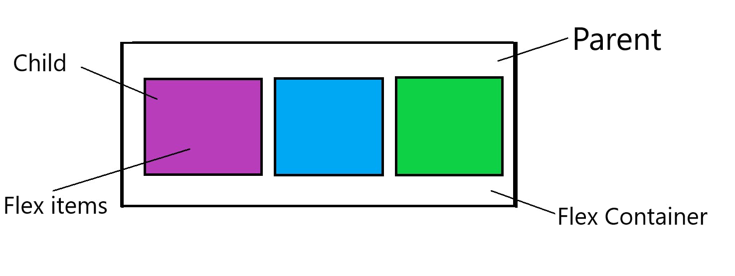
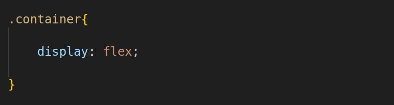
Flex-Container is a parent container. The Flex-container becomes flexible by setting the display property to the flex. The Flex Container Properties are -
Display
flex-direction
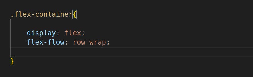
flex-wrap
flex-flow
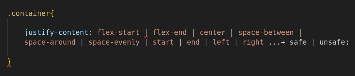
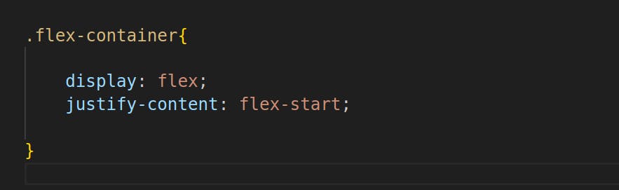
justify-content
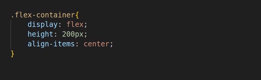
align-items
align-content
Display
When you set display-flex on a container element, all flex properties are applied to that container element, all flex properties are applied to that container and its direct children. By applying display-flex all flex elements get aligned side by side.
Flex-Direction

Every flex container has a main axis defining the direction of flex items. By default, flex-direction is set as a row, which means that the main axis goes from left to right, and items from the container will display in a row.
flex-direction: row :- left to right in ltr(left-to-right); right to left in rtl(right-to-left).
flex-direction: row-reverse:*- right to left in ltr; left to right in RTL.*
flex-direction: column:- Same as row but top to bottom.
flex-direction: column-reverse:- Same as row-reverse but bottom to top.
Flex-Wrap
By default, flex items will all try to fit onto one line. You can change that and allow the items to wrap as needed with this property.
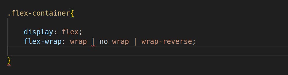
nowrap:- all flex items will be on one line.
wrap:- flex items will wrap onto multiple lines, from top to bottom.
wrap-reverse:- flex items will wrap onto multiple lines from bottom to top.
flex-flow:
The flex-flow property is a shorthand property for setting both the flex-direction and flex-wrap properties.
Justify-content
To distribute our flex items along the main axis, we can use justify-content. It also exerts some control over the alignment of items when they overflow the line.
Flex-start (Default): The flex-start value aligns the flex items at the beginning of the container.
Flex-end: The flex-end value aligns the flex items at the end of the container.
justify-content: flex-end;start:- items are packed toward the start of the writing-mode direction.
end:- items are packed toward the end of the writing-mode direction.
left:- items are packed toward the left edge of the container unless that doesn't make sense with the flex-direction, then it behaves like a start.
right:- items are packed toward the right edge of the container unless that doesn't make sense with the flex-direction, then it behaves like an end.
center:- items are centered along the line.
space-between: The space-between value displays the flex with space between the boxes. items Equal space distribution between the boxes will happen and start-end boxes will move to their extreme positions. (This doesn't happen in space-around)
justify-content: space-between;Space-around: The space-around value displays the flex items with space before, between, and after, the lines. The space between the boxes will be the same, and the space between the start and end will be the same but the space b/w boxes and the start or end will not be the same.
justify-content: space-around;Space-evenly: The space distribution at the start, between, and end will be equal.
justify-content: space- evenly;
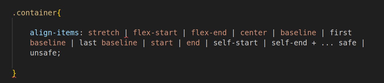
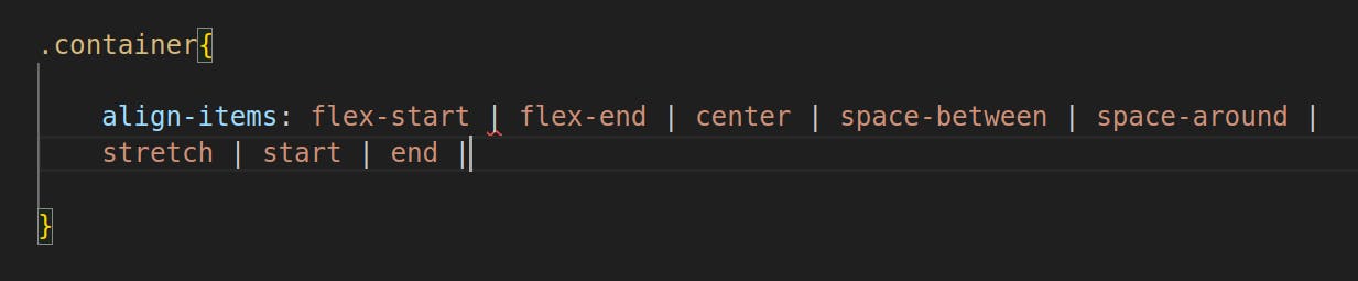
Align-Items:
The align-items property is used to align the flex items. Used for single rows only. It is responsible for the alignment of the flex items in the vertical axis.
Ex. Center: The center value aligns the flex items in the middle of the container.
Its properties:
Flex-start: The flex-start value aligns the flex items at the top of the container.
align-items: flex-start;Flex-end: The flex-end value aligns the flex items at the bottom of the container.
align-items: flex-end;Stretch (Default): The stretch value stretches the flex items to fill the container.
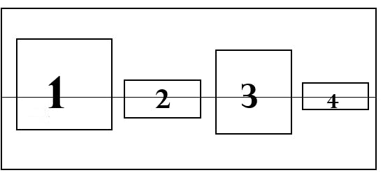
align-items: stretch;Baseline: The baseline value aligns the flex items such as their baselines align.
align-items: baseline;Start / self-start: items are placed at the start of the cross-axis.
end / self-end: Items are centered on the cross-axis.
Align-Content
The aligns a flex container's lines when there is extra space in the cross-axis, similar to how justify-content aligns individual items within the main axis.
NOTE: This property only takes effect on multi-line flexible containers, where flex-wrap is set to either wrap or wrap-reverse. A single-line flexible container will not reflect align-content.
normal(default):- Items are packed in their default position as if no value was set.
flex-start / start:- items packed to the start of the container. The flex-start honors the flex direction while the start honors the writing-mode direction.
flex-end / end:- items packed to the end of the container. The (more support) flex-end honors the flex-direction while the end honors the writing-mode direction.
center:- Items centered in the container.
space-between:- items evenly distributed; the first line is at the start of the container while the last one is at the end.
space-around:- items are evenly distributed with equal space around each line.
**Properties for the Children
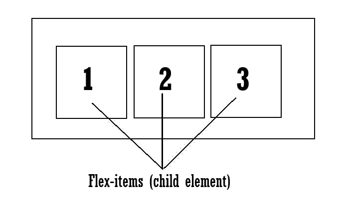
Child Element Items:
A direct child element of a flex container automatically becomes flexible (flex) items.
The flex item properties are:
order
flex-grow
flex-shrink
flex-basis
flex
align-self
Order:
By default, flex items are laid out in the source order. However, the order property controls the order in which they appear in the flex container.
Flex-grow:
The flex-grow property specifies how much a flex item will grow relative to the rest of the flex items. The value must be a number, the default value is 0. it can be applied to the individual flex-items
Ex: <div style = "flex-grow:1">2</div>
- Negative numbers are invalid
Flex-shrink:
The flex-shrink property specifies how much a flex item will shrink relative to the rest of flex the items. The value must be a number, the default value is 1.
Ex. <div style = "flex-shrink:0">3</div>
Flex-basis:
The flex-basis property specifies the initial length of a flex item. Visually looks the same when the content is less. If the content is more than the flex width then the width will be increased. Content will not be trimmed out. That particular flex will be responsive.
Ex. <div style = "flex-basis:200px">3</div>
flex:
This is the shorthand for flex-grow, flex-shrink and flex-basis combined. The second and third parameters (flex-shrink and flex-basis) are optional. The default is 0 1 auto, but if you set it with a single number value, like flex: 5;, that changes the flex-basis to 0%, so it’s like setting flex-grow: 5; flex-shrink: 1; flex-basis: 0%;.
.``item { flex: none | [ <'flex-grow'> <'flex-shrink'>? || <'flex-basis> ] }
align-self:
This allows the default alignment (or the one specified by align-items) to be overridden for individual flex items.
Please see the align-items explanation to understand the available values.
.item {
  align-self: auto | flex-start | flex-end | center | baseline | stretch;
}
Note that float, clear and vertical-align does not affect a flex item.
These are some flex properties that we use to align an element. In the next article, we will understand the Grid. Stay tuned for such an article and share it, like it.