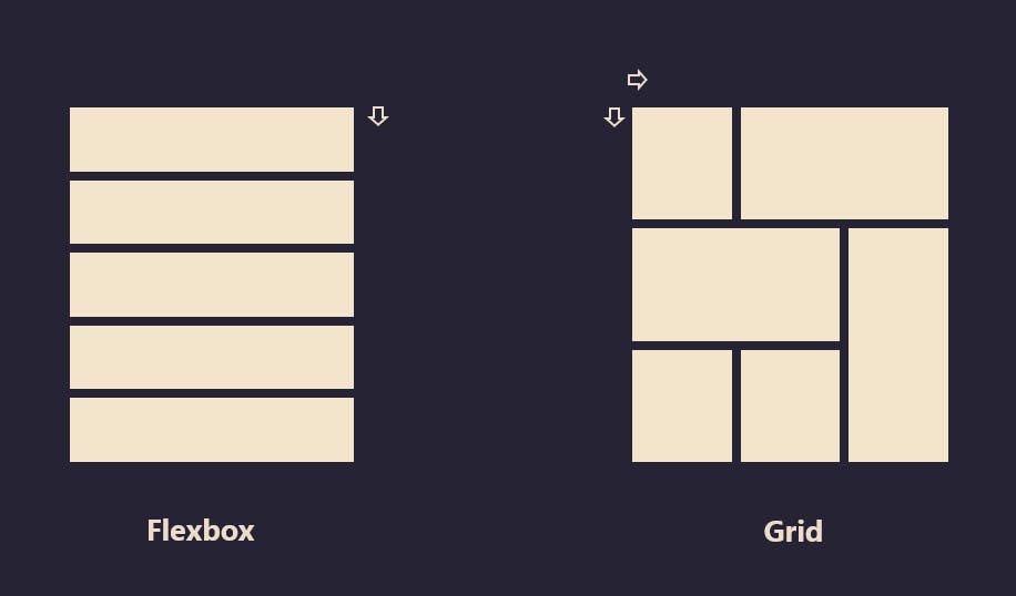
In this article, we are going to understand what is a Grid property in CSS and how it helps us to design a beautiful web page. Flex can work on either row or column at a time but Grid can work on both. Grid gives us more flexibility to move around the blocks irrespective of HTML markup.
CSS GRID helps us to create the outer layout of the webpage. CSS Grids are for 2D layouts. It works with both rows and columns.
What is CSS GRID 🤔
CSS Grid Layout is the most powerful layout system available in CSS. It is said to be a 2-dimensional system, meaning it can handle both columns and rows, unlike Flexbox is largely a one-dimensional system (either in a column or a row). Flexbox layout is most appropriate to the components of an application.

Display
Turning an HTML element into a grid is easy. You just have to set the display to a grid. In the grid system, the parent is referred to as a container and the children are called items.
Values:
grid– generates a block-level gridinline-grid– generates an inline-level grid
Example:-
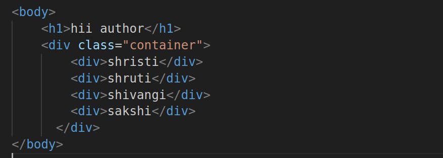
This is a div with a class of containers and inside the container, we have four child elements. note: you can call the .container any name you want, common names you'll usually see are .wrapper, .grid, or .grid-container but in this case, we'll be using the .container

Now let's add a simple styling to this so we can distinguish them.

Output

